
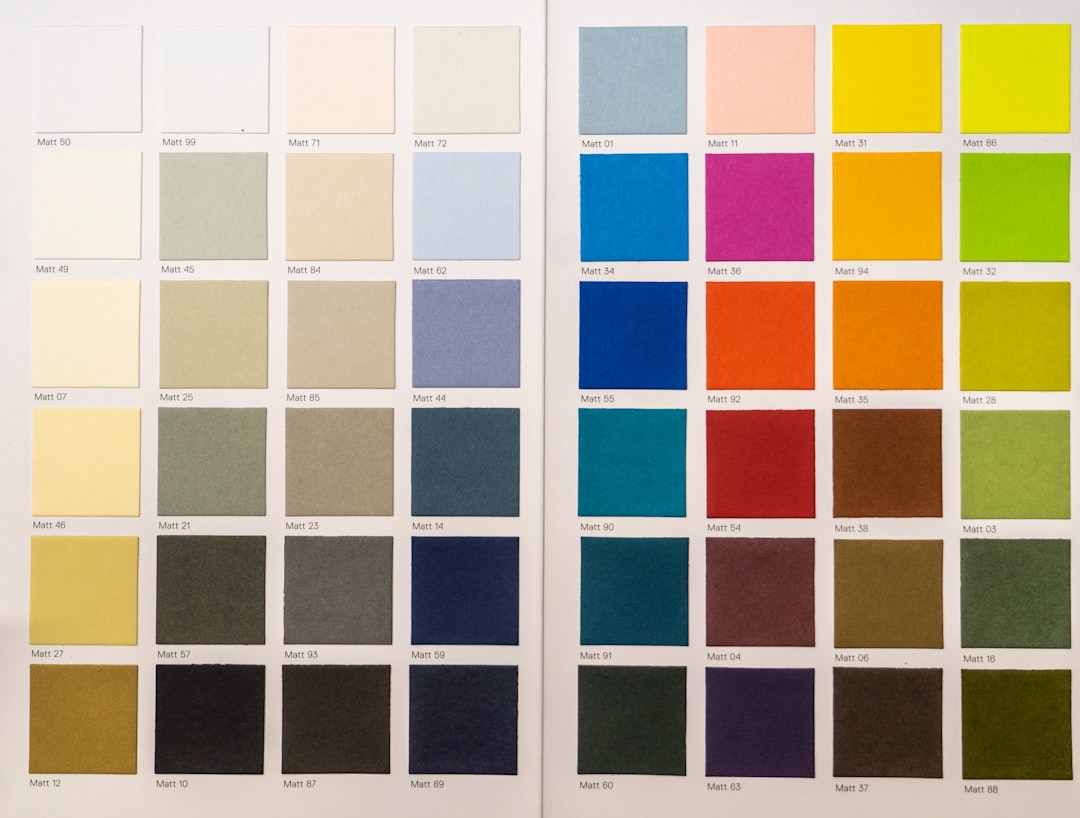
How to Choose the Right Color Palette for Your Home
Choosing a color palette is one of the most impactful decisions you’ll make for your home. The right scheme improves flow between rooms, supports function, and makes everyday life feel calmer and more intentional.
This guide gives practical, step-by-step advice for selecting a palette that fits your space, light, and lifestyle—plus quick product-based ideas to help implement each choice.
1. Start with light, size, and function
Before you pick a hue, evaluate natural light, room size, and how the room will be used. Bright, north-facing rooms tolerate cooler tones; south-facing rooms can handle richer, warmer colors. Smaller rooms benefit from lighter, warmer neutrals to feel more open; large rooms can carry deeper, moody shades.
Layer lighting to see colors accurately at different times. Consider adding a standing light for even distribution and to test how tones change in evening light: Floor Lamps provide flexible, directional light to help you judge paint and fabric choices.
2. Build a reliable three-part system
Work with a simple framework: one base color (walls), one accent color (focal elements), and one trim/neutral (moldings, ceilings). That structure keeps a home cohesive while letting you vary rooms.
Base colors should be the most prevalent and timeless. Accent colors add character—choose one or two across a home to create rhythm. Use window treatments as anchors for scale and continuity; switching fabric or pattern can read as a new accent without repainting: Curtain Panels help unify color and pattern while controlling light.
3. Use texture and storage to balance color
Color is perceived differently on glossy versus matte surfaces and on wood, metal, or woven textures. Introduce natural textures to soften strong hues and to add depth without more color.
Practical storage can be a design asset: woven or neutral baskets add texture and break up color blocks while keeping clutter hidden. Integrate storage pieces that complement your palette—a neutral basket can calm a bold wall, a dark basket can warm a pale scheme: Decorative Storage Baskets.
4. Ground rooms with rugs and large textiles
Large textiles like area rugs and upholstery determine how colors sit in a room. A rug anchors furniture and can set the palette for everything else; choose a rug that ties together your base and accent tones.
When testing colors, place samples on or near the rug and main seating to see interactions across materials. If the rug is patterned, pull a subtle color from it for accent walls or cushions: Decorative Area Rugs make deciding easier by giving you a defined color story to work around.
5. Layer soft textiles for comfort and cohesion
Throws, cushions, and bedding are quick, low-commitment ways to test or shift a palette. They let you try seasonal changes (warm rusts in fall, cool blues in summer) without repainting.
Keep at least one consistent neutral across rooms, then rotate one or two accent textiles to refresh the look. A well-chosen throw can bring a living room or bedroom palette together instantly: Throw Blankets.
6. Kitchens and dining: match finishes, not every surface
Kitchens are busiest: pick durable colors that hide mess and pair well with cabinetry and countertop materials. Instead of trying to match every object, coordinate finishes—metal, wood, and stone—and use tableware to add controlled color.
Choose dinnerware and serving pieces that complement your accent color to create a harmonious dining setup without changing permanent fixtures: Dinnerware Sets. Small swaps here have a big visual effect.
7. Bathrooms and small spaces: keep it bright and simple
Bathrooms and powder rooms are ideal places to introduce small pops of color because they require less commitment. Use clean, light base colors on walls and bring in accent hues with accessories and storage.
Countertop and vanity accessories let you test a color choice while keeping the core surfaces neutral and resale-friendly. Swap towels, soap dispensers, or trays to change mood quickly: Bathroom Countertop Organizers can coordinate color and texture without permanent changes.
8. Finishing touches and task lighting
Small elements—lamps, art frames, hardware—are where a palette feels finished. Use accent pieces to repeat an accent color three times in a room (triangulation) so the eye moves naturally. Good task and ambient lighting reveal how well colors perform.
Bedside and side-table lighting gives you a way to soften colors at night and to create pockets of warmth that support deeper wall colors. Consider adding complementary table lighting as a final layer: Table Lamps.
Quick checklist: choosing and testing colors
- Test in natural and artificial light at different times of day.
- Use a three-part system: base, accent, trim/neutral.
- Bring in texture—rugs, baskets, throws—before committing to paint.
- Pick one consistent neutral across adjacent rooms for flow.
- Introduce color with swap-friendly items: curtains, throws, tableware, organizers.
- Use lighting layers to evaluate final effect.
Practical implementation plan
1) Pick your base color and paint a large sample on the main wall. 2) Layer sample swatches of fabric, a rug, and one accent object to evaluate relationships. 3) Live with samples for a week to test variations in daylight and evening light. 4) Finalize a trim color and choose 2–3 accessories to repeat the accent across the room.
Conclusion
Choosing the right palette is a methodical process: assess light and function, use a three-part color system, and test with textiles and lighting before committing. Small swaps—rugs, curtains, throws, and tableware—let you refine color without costly changes. Start with samples, live with them, and layer gradually for a cohesive home.
FAQ
Q: How many colors should I use in one room?
A: Aim for three primary colors: a dominant base, an accent, and a neutral/trim. Add subtle variations in tone and texture rather than more hues.
Q: How do I test colors accurately?
A: Paint large sample patches on multiple walls and view at different times of day under your room’s lighting. Add fabric and rug samples to see interactions.
Q: Can I use bold colors in small rooms?
A: Yes—use bold color on a single wall or as an accent through textiles and storage. Balance with neutral trim and reflective lighting.
Q: What’s the easiest way to change a room’s palette seasonally?
A: Swap soft textiles (throws, cushions), tableware, and curtains. These items update color quickly and are low-cost.
Q: How should I coordinate open-plan spaces?
A: Use one neutral base throughout and repeat one or two accent colors in adjacent zones to maintain visual flow while allowing each area to have its own character.